
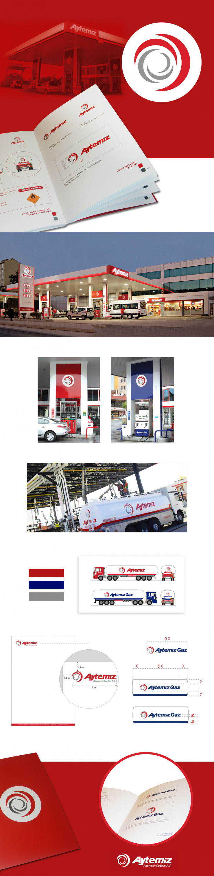
Aytemiz Petrol, operating in energy field for almost half a century, updated its corporate look in 2010.
A new emblem with new corporate identity standards were designed for the brand. The new look, visible in all gas stations, company facilities, tankers and printed corporate materials, was standardized and indicated in the Brand Identity Book.
The new Aytemiz emblem, with repeating moon shapes, getting bigger as in a fibonacci sequence, symbolize dynamism and emphasize the increasing experience, prestige and determination of Aytemiz Petrol in its field.
The red colour in the emblem symbolizes energy and the power of Aytemiz in the sector, while the grey shows the reliance and stability of the brand.
Project Role & Scope;
Logo Design, Corporate Identity Design, Brand Design, Emblem Design, Print Design
Damla Ayzeren – 2010 / 2012
Client: Aytemiz Petrol